I had an experience the other day that transformed my thoughts on interfaces and I’d like to share it. I believe that not enough of us understand what an interface really is and that this is hampering our ability to provide good user experience.
One of the problems we have when answering the question “What is an interface?” is that we don’t have an accurate representation of what an interface looks like. There is a tendency for us to become confused and pick just one concrete instance of an interface that we know well, leading to responses like “Oh, you mean a GUI” or for those that have read books like “The Design Of Everyday Things” something more physical like a door handle.
Like many people in the tech industry I’ve become acquainted with a small subset of interfaces known as GUIs and this has largely controlled the frame in which I recognise and understand interfaces.
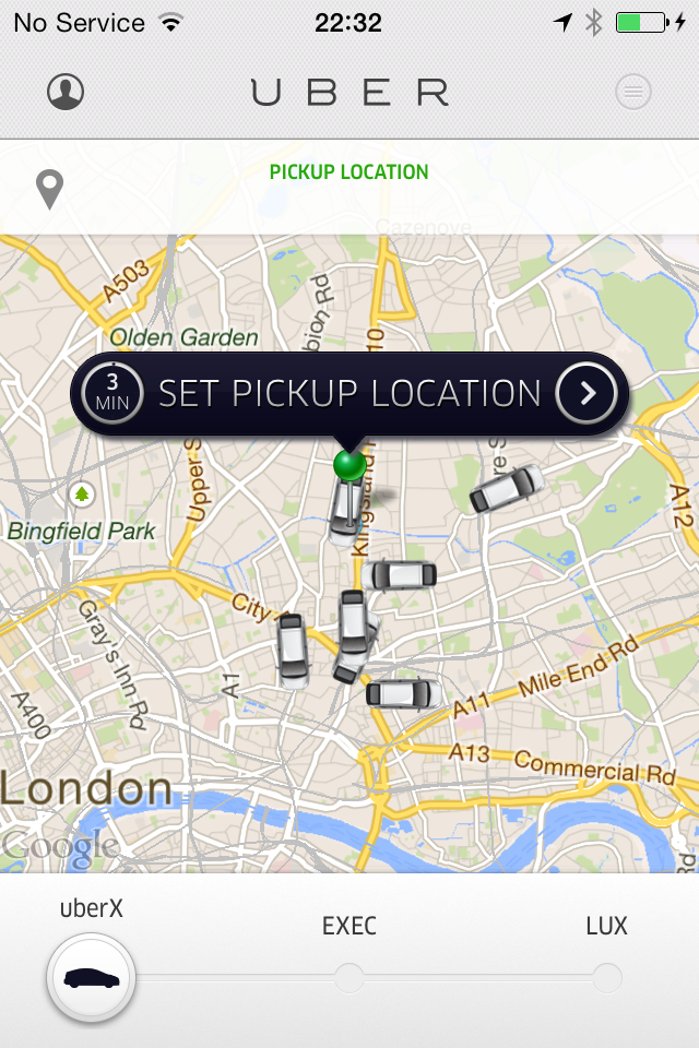
So, like you, when I think of an interface I normally think of this:
And not this:
Perhaps you’re wondering why I’ve shown you a street full of cars and called it an interface. What is the use in that?
Empathising
To illustrate what I mean, I’m going to talk about Uber for a little bit.
Uber is an app company that aims to connect stranded city-dwellers with a driver on-the-go.
A user opens the app, sets their pickup location, and requests a vehicle.
Then they wait.
The other day on a particularly cold and rainy night I undertook this ritual, putting my phone back into my pocket as I waited for the 5-10 minutes it takes a driver to arrive.
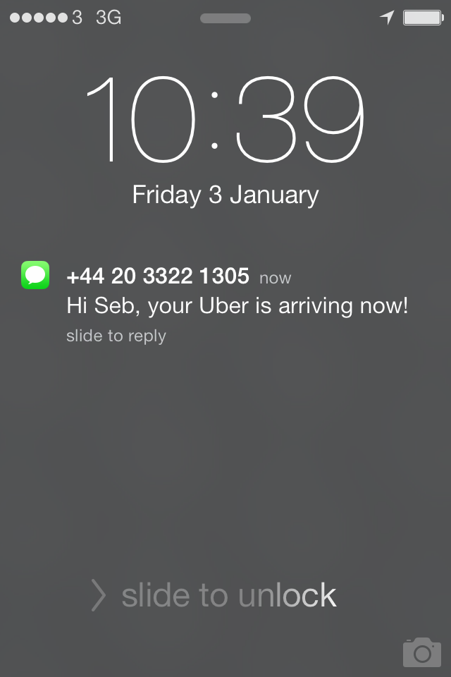
So there I was, staring into the dark, wet street waiting for my car to arrive. As it drew close, I received a notification from Uber in the form of a vibration/text message and reached into my pocket to retrieve my phone.
The interface
Your natural inclination might be to think that I’m not currently interfaced with Uber because I do not have their app on screen. However this is something I fundamentally disagree with.
interface
ˈɪntəfeɪs/
noun
- a point where two systems, subjects, organizations, etc. meet and interact.
Recall that the problem that Uber is trying to solve is that of connecting people to drivers.
That is the core interface: a connection between a person and a driver.
So I’m standing in a busy street with a message from Uber telling me that somewhere in front of me is a car. And as of yet I don’t know precisely where it is or how to differentiate it from other vehicles, so I need information to recognise it such as its make, colour and number plate.
This information that urges a user to interact in the right way exists under a bit of umbrella terminology known as a “perceived affordance”.
The word “affordance” was created by the psychologist J. J. Gibson to refer to actionable properties between the world and an actor (e.g. person). To Gibson, affordances were relationships. Later on this word was introduced to Design by the famous usability engineer, Don Norman. He also prefixed it with an additional word “perceived”, as he felt that while an object might have many affordances it’s important to distinguish between those that are easily perceived and those that are not, in order that designers might bias perceptions towards particular affordances.
In order to find the information necessary to continue the interaction, I need to unlock my phone and re-open the Uber app. I believe there’s an opportunity here to ease the interaction between user and driver. If we consider the app to be a sub-interface existing in relation to a larger interface between the user and the driver we can begin to notice other easier to perceive sub-interfaces which exist alongside it. A perfect example is the text message that notified me of the driver’s arrival.
The text message can be used to give the information required to quickly and easily identify and search for the driver.
“Hi Seb, your Uber is arriving now!”
Could become
“Hi Seb, your Uber is arriving now! Look out for the silver BMW with the number plate K50 WTB.”
Almost all notifications can be considered a place to inject actionable interfacing information into a user’s head.
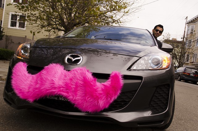
This isn’t the only affordance that could be used. Other car companies are incidentally also using their own perceived affordances.
That’s a competitor called Lyft. Lyft handed out “carstaches” to their drivers. This is being hailed as a branding and marketing exercise which it is a great example of, but it is also a perceived affordance which lets you quickly identify your lyft.
So what does an interface look like?
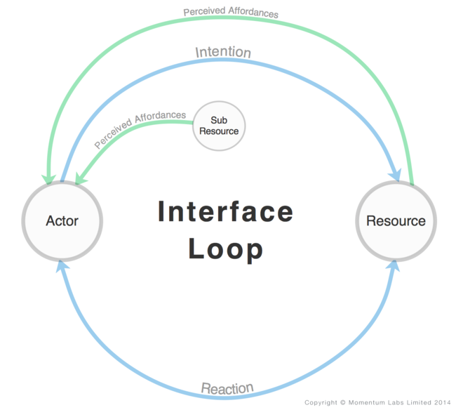
To me the term interface describes a conduit between a person and a resource that a designer might bias towards particular user experiences with the use of perceived affordances.
If I was to visualise the mental model I have of an interface I would draw a loop that connects your head to a resource.
Technology is rapidly allowing us to interface with the world in new and profound ways. We shouldn’t let old notions of what an interface is dictate to us how we interact with the world. We must always remember that user experience is a function of who and where we are.
Interfaces start in your head.


